
In one sentence
Every page in the dashboard now follows the same layout. Pages are tighter, calmer and easier to scan, and they work even better on phones and tablets.
What we did
We went through close to 40 screens: entities, applications, cases, transactions, procedures, risk score, monitoring, ongoing due diligence, reports, developer tools, settings and more. Each one now uses the same small set of building blocks.
One frame for the whole app. The main content sits on a single rounded card with the navigation beside it. Pages no longer stack boxes inside boxes.
One title bar on every page. Each page starts with the same slim bar: the page name on the left and the main actions on the right. It replaces the large decorative headings, which took up a lot of space and looked different from page to page.
Tables run full width and show more rows. Lists stretch edge to edge, and rows are more compact by default, so you see more records without scrolling. Anyone who prefers roomier rows can switch compact mode off once, and it applies to every table.
Detail pages share one structure. A person, company, application or case page now reads the same way, top to bottom: where you are, who the page is about, then the tabs. The tab row stays pinned at the top while you scroll.
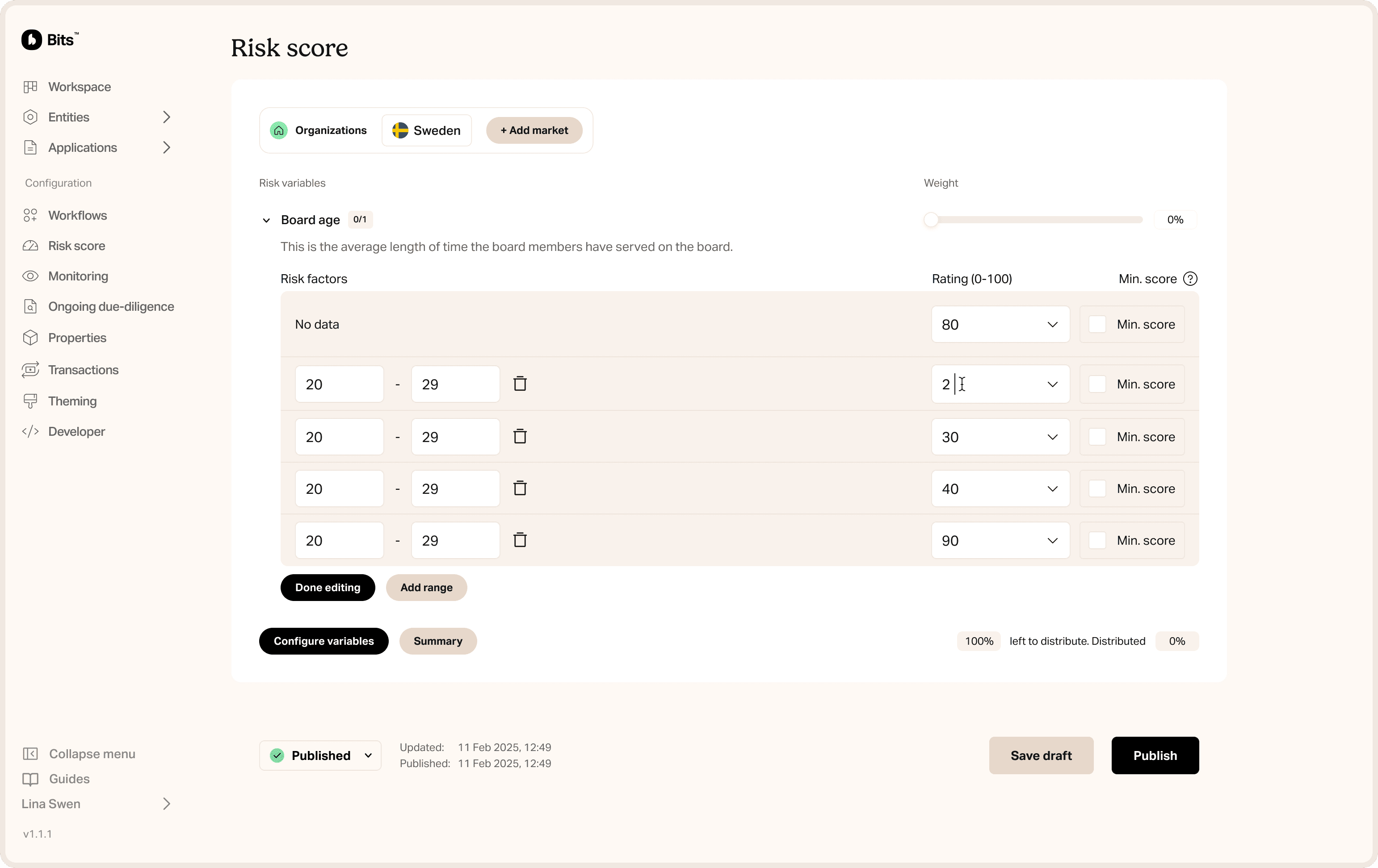
Settings pages read like documents. Configuration screens (monitoring, risk score, report settings and others) are now sections separated by thin lines, not a pile of separate boxes, with one save area at the bottom.
Tidier action buttons. Reports keep all their actions (language, save, publish, more) in one bar at the top. Approve and Decline on applications only appear when the application is actually waiting for a manual review, so nobody sees buttons they can’t use.
Simpler risk score screen. Markets are picked from one dropdown, not a long row of tabs, and adding a market takes you straight to it.
Better on desktop
More information above the fold. The slimmer headers and compact rows give real data the space that padding and big titles used to take.
Faster scanning. Titles, actions, tabs and tables sit in the same place on every page, so your eye knows where to look.
Context stays in view. Page headers and tab rows stay pinned while you scroll a long table or form.
Your place is remembered. On monitoring, procedure settings and reports, the open tab is saved in the link. Refreshing, pressing Back or sharing the URL brings you to the same tab.
Fewer one-off settings menus. The scattered table settings menus have become one shared setting.
Better on mobile and tablet
Bigger touch targets. Small buttons, search boxes and filters grow to a finger-friendly size on touch screens, so there are fewer missed taps.
No sideways scrolling for tabs. When the tabs don’t fit the screen, the extra ones fold into a “+N more” menu that still shows their counts. The tab you’re on always stays visible.
Headers adapt. When space is tight, the title and its actions wrap onto two lines. Nothing gets cut off or squeezed.
Tighter margins on small screens. Settings pages use narrower side margins on phones, so the content gets the width.
Long lists scroll inside their panel. Some large tables, like court records, scroll within their own area, so the rest of the page stays put.
Why it matters
Users learn the product once. When every page behaves the same way, people get faster and more confident, and new team members need less training.
It looks more professional and trustworthy. Consistent spacing, alignment and structure make the product feel deliberate and calm. That matters for a compliance tool people rely on every day.
More accessible. Keyboard users now get a clear outline on the tab they’re on, and touch targets meet the recommended minimum size.


File goAML SAR and STR reports without leaving Bits
Create suspicious activity and suspicious transaction reports for Sweden and Finland in the Bits dashboard, prefilled from your entities and exported as goAML XML.

Transaction monitoring cases that explain themselves
Every transaction monitoring case in Bits shows the transaction, both parties, and exactly which rules fired, with a one-click plain-text summary for your case notes.

Insights: your compliance operation at a glance
The Insights page in Bits charts cases, applications, risk scores, and entity growth over any period up to 24 months, filtered by type, status, assignee, market, and workflow.